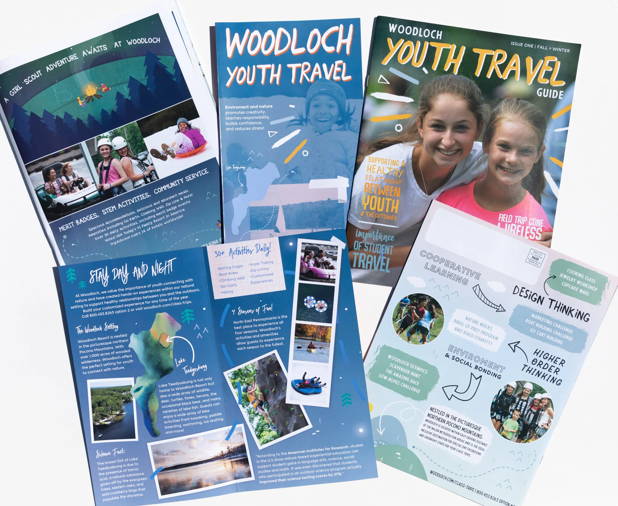
BRAND IDENTITY | WOODLOCH Youth Travel
The branding project for Woodloch Youth Travel was started from scratch in order to differentiate and bring awareness to this portion of Woodloch’s Group Travel. This category of travel includes scout groups, class trips, and youth groups. My focus was to create a fun brand not only attractive for youth but also for educators and group leaders. Hand written typography, a bold and bright color palette, nature graphics and map symbols, custom illustrations and “scrapbook” features tie the design together. Map elements can be spotted on all print collateral which included ads, post cards, brochures, and newsletters. This was a fun way to create cohesion between all pieces; the destination either ended at an important advertising point or illustration of Woodloch.